View Area
Screen Width
Today people access websites from a host of different devices, meaning you need to ensure that your project will work in a desktop browser as well as on a phone equally well.
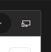
For now, the only way to test this in Henosia, is by resizing your window, but a feature to see how your product looks at various screen sizes, is coming soon in the top right corner of the view area.