Henosia

Property Panels

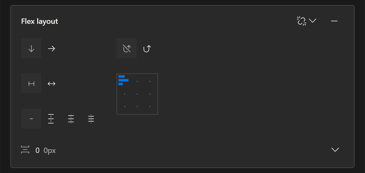
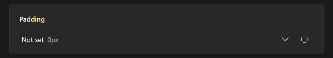
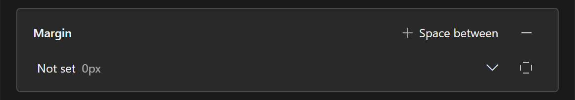
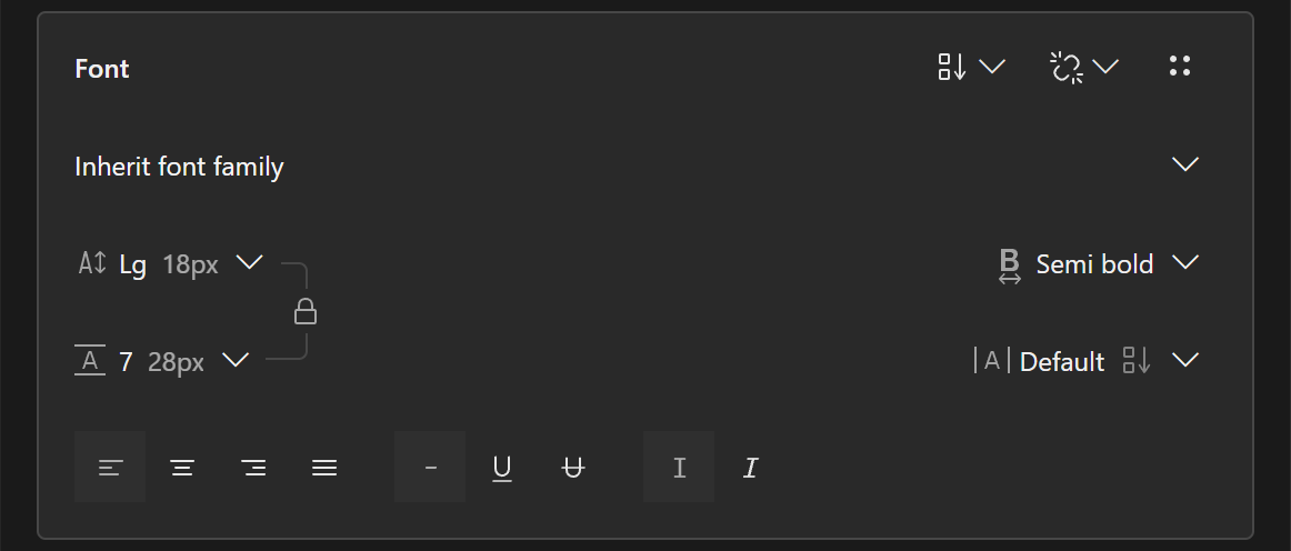
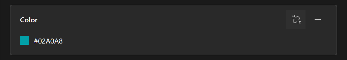
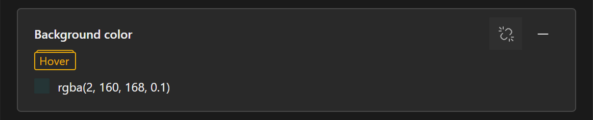
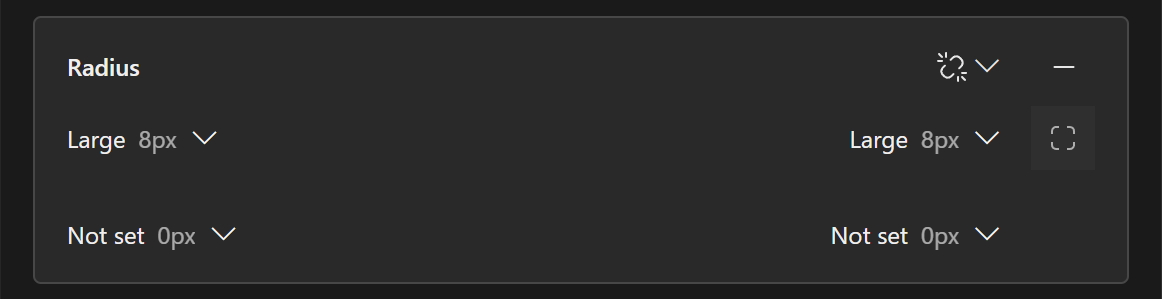
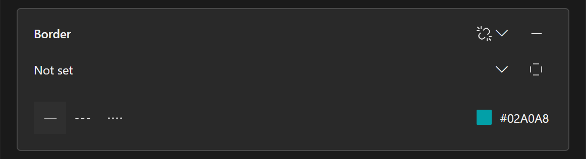
You can change any property of your elements using one of the eleven property panels: Size, Self layout, Layout, Padding, Margin, Font, Color, Background color, Radius, Border, Shadow, Image, Component and Advanced (not all are shown below).

A close up of the buttons for all the property panels above the prompt field. The buttons shown are Size, Layout, Padding, Margin, Font, Color, Background color, Radius, Border, Shadow, Component and Advanced.

Switch to Select mode and select what you want to edit directly in the preview. Once you have selected an element, click a badge to open the corresponding props panel to edit any property you wish. You can see the content of all the property panels below.

A close up of the Size property panel. It contains the properties Width and Height and buttons to show Minimum and maximum values for Width and height. It also has a detach button. A close up of the Self Layout property panel. It contains the properties Stretch, Grow and Shrink. It also has a detach button. A close up of the Flex Layout property panel. It contains the properties Direction, Wrap, Stretch, Spread available space, Justification and alignement, and Gap. It also has a detach button and a remove button. A close up of the Padding property panel. It contains the property Padding. It also has a remove button and a button to divide the padding property into four individual padding values, one for each side of an element. A close up of the Margin property panel. It contains the property Margin. It also has a remove button and a button to divide the margin property into four individual margin values, one for each side of an element. Finally, it has a button to show and set the property Space between A close up of the Font property panel. It contains the properties Font family, Font size, Line height, Font weight, letter Spacing, Justification and Styling. It also has a detach button and a button to control inheritance. A close up of the Color property panel. It contains the property Color set to #02A0A8. It also has a detach button and a remove button. A close up of the Background Color property panel. It contains the property Background Color set to rgba(2,160,168,0.1), and you can see conditional styling is activated to set the color in hover state. It also has a detach button and a remove button. A close up of the Radius property panel. Currently, individual values are on, and radius is set for the two top corners of the element. It also has a detach button and a remove button. A close up of the Border property panel. It contains the properties Border width, border type and Border color. It has a button to divide the border width property into four individual border values, one for each side of an element. It also has a detach button and a remove button. A close up of the Shadow property panel. It contains the properties Shadow size and Shadow color. It also has a detach button and a remove button.

The last three panels, Image, Component and Advanced are a bit special.

Image

If you want to insert an image manually, it requires a bit of work up front. Follow the following steps to prepare for an image:

  1. Click the + next to the prompt field to open the Insert panel.
  2. In the Insert panel, select the third tab named HTML Elements.
  3. Use the search bar to find the img tag
  4. Select it and click insert.
  5. Using the placement panel, choose where you want the image to be in your product.

Now you have prepared the product for inserting the image. Select the placeholder image that has been inserted and open the Image property panel pictured below.

A close up of the Image property panel. It contains two fields, the source for the image and the alternative text for the image. It also allows to add more properties as needed.

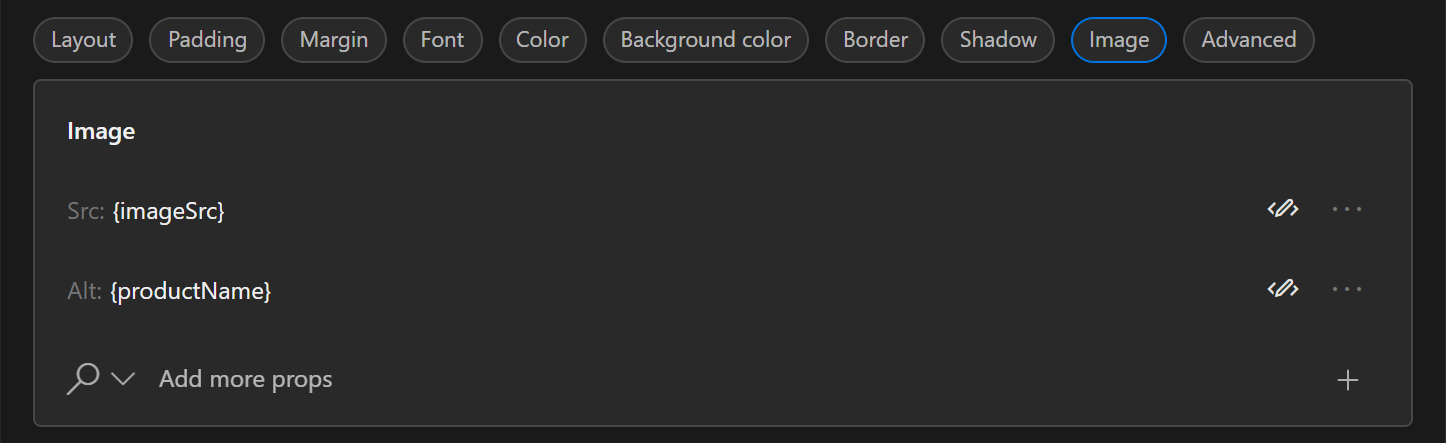
Go to Assets in the left sidebar, copy the path to the image you want inserted, and paste it in the Src field. You can also add an alternative text for it in the Alt field (this is for screen readers to read).

Perhaps you already have an image in your product, and just want it replaced. Then just go to Assets and copy the path to the image you want instead, select the image you want to replace, open the Image property panel, and paste the path of the new image into the Src field.

If you don't have any images in Assets, read more under Assets about how to upload the image you need.

Components

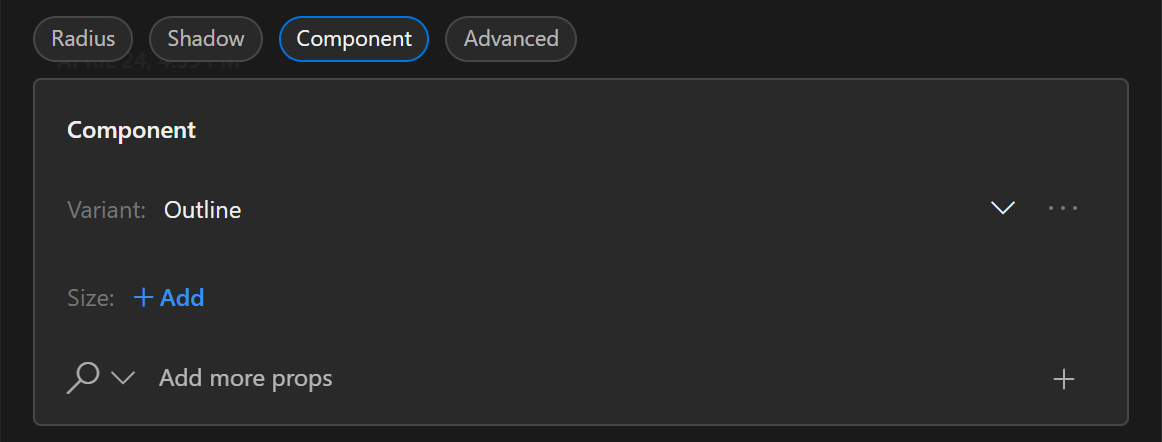
Component does not contain basic Tailwind properties, but rather the properties of a given component. In this case it is the properties of a button, where you can choose a certain variant and size.
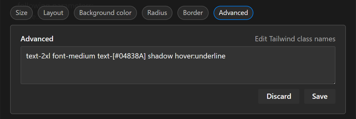
A close up of the Component property panel. It contains two poperties, the Component variant and the Component size. It also allows to add more properties as needed.

Advanced

While we have far most of the common Tailwind properties covered in the panels above, sometimes you might need a more advanced property. This can then be added to the properties already on the element, in this text field.

A close up of the Advanced property panel. It a free text field for entering Tailwind class names, and two buttons to Discard and Save, respectively.

Further resources

On this page